In the digital age, data is generated at an unprecedented rate, and making sense of this vast amount of information requires powerful tools for data visualization. D3.js (Data-Driven Documents) is one such tool that stands out due to its flexibility and the ability to create dynamic, interactive data visualizations in the browser. This article delves into the world of data visualization with D3.js, covering its features, how to get started, core concepts, and best practices for creating stunning visual representations of data.
Creating a Basic JavaScript Library: A Comprehensive Guide
What is D3.js?
D3.js is a JavaScript library for producing dynamic, interactive data visualizations in web browsers. It uses the widely implemented SVG (Scalable Vector Graphics), HTML5, and CSS standards. D3.js allows developers to bind data to a Document Object Model (DOM), and then apply data-driven transformations to the document.
Key Features of D3.js
- Flexibility: Unlike other visualization libraries that offer pre-built chart types, D3.js provides building blocks for creating custom visualizations.
- Interactivity: D3.js supports a wide range of user interactions, such as tooltips, zooming, and dragging, making the data visualizations more engaging.
- Performance: By directly manipulating the DOM and using modern web standards, D3.js ensures high-performance data visualizations.
- Data Binding: D3.js efficiently binds data visualizations to DOM elements, allowing seamless updates and transitions.
Getting Started with D3.js
Setting Up the Environment
To start using D3.js, you need a web development environment. You can include D3.js in your project by downloading it from the official website or by using a CDN. Here’s how to include D3.js using a CDN in your HTML file:
<!DOCTYPE html>
<html>
<head>
    <title>Data Visualization with D3.js</title>
    <script src="https://d3js.org/d3.v7.min.js"></script>
</head>
<body>
    <script>
        // Your D3.js code will go here
    </script>
</body>
</html>
Basic Example: Creating a Simple Bar Chart
Let’s create a simple bar chart to understand the basics of D3.js. We’ll use an array of numbers and bind this data to a set of SVG rectangles.
<!DOCTYPE html>
<html>
<head>
    <title>Simple Bar Chart with D3.js</title>
    <script src="https://d3js.org/d3.v7.min.js"></script>
</head>
<body>
    <script>
        // Sample data
        const data = [30, 86, 168, 281, 303, 365];

        // Set the dimensions of the canvas / graph
        const width = 500;
        const height = 300;
        const barWidth = width / data.length;

        // Create an SVG container
        const svg = d3.select("body").append("svg")
            .attr("width", width)
            .attr("height", height);

        // Create bars
        svg.selectAll("rect")
            .data(data)
            .enter().append("rect")
            .attr("width", barWidth - 1)
            .attr("height", d => d)
            .attr("x", (d, i) => i * barWidth)
            .attr("y", d => height - d)
            .attr("fill", "steelblue");
    </script>
</body>
</html>
In this example, we create an SVG container and append a rectangle (<rect>) for each data point in the array. The height of each rectangle is determined by the corresponding data value.
Core Concepts of D3.js
To leverage the full potential of D3.js, it’s essential to understand its core concepts.
Selections
Selections are the primary means of selecting and manipulating elements in D3.js. Using selections, you can bind data to DOM elements and apply transformations. For example:
d3.select("body").append("p").text("Hello, D3.js!");This code selects the <body> element and appends a new <p> element with the text “Hello, D3.js!”.
Data Binding
Data binding in D3.js involves linking data to DOM elements. This is achieved using the .data() method, which binds an array of data to a selection of elements.
const data = [10, 20, 30, 40, 50];
const selection = d3.select("body").selectAll("p").data(data);

selection.enter().append("p").text(d => `Value: ${d}`);
Here, we bind an array of numbers to a selection of <p> elements and append a new <p> for each data point.
Scales
Scales are functions that map data values to visual variables, such as position, length, or color. D3.js provides several scale types, including linear, ordinal, and time scales.
const scale = d3.scaleLinear().domain([0, d3.max(data)]).range([0, 300]);In this example, we create a linear scale that maps data values between 0 and the maximum value in the dataset to a range of 0 to 300 pixels.
Axes
Axes are used to visualize scales and provide context for data values. D3.js provides built-in functions to generate axes.
const xAxis = d3.axisBottom(scale);
svg.append("g").attr("transform", "translate(0,300)").call(xAxis);
This code creates a bottom axis using the previously defined scale and appends it to the SVG container.
Transitions
Transitions in D3.js allow smooth animations between states. They are useful for animating changes in data or visual properties.
svg.selectAll("rect")
    .data(newData)
    .transition()
    .duration(1000)
    .attr("height", d => d)
    .attr("y", d => height - d);
Here, we apply a transition to update the height and y-position of rectangles based on new data values.
Advanced Data Visualization Techniques
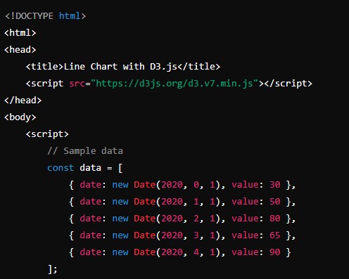
Creating a Line Chart
A line chart is useful for visualizing trends over time. Here’s how to create a basic line chart with D3.js:
<!DOCTYPE html>
<html>
<head>
    <title>Line Chart with D3.js</title>
    <script src="https://d3js.org/d3.v7.min.js"></script>
</head>
<body>
    <script>
        // Sample data
        const data = [
            { date: new Date(2020, 0, 1), value: 30 },
            { date: new Date(2020, 1, 1), value: 50 },
            { date: new Date(2020, 2, 1), value: 80 },
            { date: new Date(2020, 3, 1), value: 65 },
            { date: new Date(2020, 4, 1), value: 90 }
        ];

        // Set dimensions
        const width = 600;
        const height = 400;
        const margin = { top: 20, right: 30, bottom: 30, left: 40 };

        // Create scales
        const xScale = d3.scaleTime()
            .domain(d3.extent(data, d => d.date))
            .range([margin.left, width - margin.right]);

        const yScale = d3.scaleLinear()
            .domain([0, d3.max(data, d => d.value)])
            .range([height - margin.bottom, margin.top]);

        // Create line generator
        const line = d3.line()
            .x(d => xScale(d.date))
            .y(d => yScale(d.value));

        // Create SVG container
        const svg = d3.select("body").append("svg")
            .attr("width", width)
            .attr("height", height);

        // Append the line path
        svg.append("path")
            .datum(data)
            .attr("fill", "none")
            .attr("stroke", "steelblue")
            .attr("stroke-width", 1.5)
            .attr("d", line);

        // Append the x-axis
        svg.append("g")
            .attr("transform", `translate(0,${height - margin.bottom})`)
            .call(d3.axisBottom(xScale));

        // Append the y-axis
        svg.append("g")
            .attr("transform", `translate(${margin.left},0)`)
            .call(d3.axisLeft(yScale));
    </script>
</body>
</html>
Creating a Pie Chart
A pie chart is effective for displaying proportions. Here’s how to create a pie chart with D3.js:
<!DOCTYPE html>
<html>
<head>
    <title>Pie Chart with D3.js</title>
    <script src="https://d3js.org/d3.v7.min.js"></script>
</head>
<body>
    <script>
        // Sample data
        const data = [
            { category: 'A', value: 30 },
            { category: 'B', value: 70 },
            { category: 'C', value: 50 },
            { category: 'D', value: 90 }
        ];

        // Set dimensions
        const width = 400;
        const height = 400;
        const radius = Math.min(width, height) / 2;

        // Create color scale
        const color = d3.scaleOrdinal()
            .domain

(data.map(d => d.category))
            .range(d3.schemeCategory10);

        // Create pie generator
        const pie = d3.pie().value(d => d.value);

        // Create arc generator
        const arc = d3.arc()
            .outerRadius(radius - 10)
            .innerRadius(0);

        // Create SVG container
        const svg = d3.select("body").append("svg")
            .attr("width", width)
            .attr("height", height)
            .append("g")
            .attr("transform", `translate(${width / 2},${height / 2})`);

        // Append pie slices
        svg.selectAll("path")
            .data(pie(data))
            .enter().append("path")
            .attr("fill", d => color(d.data.category))
            .attr("d", arc);
    </script>
</body>
</html>
Creating an Interactive Scatter Plot
A scatter plot displays values for typically two variables for a set of data. Here’s how to create an interactive scatter plot with D3.js:
<!DOCTYPE html>
<html>
<head>
    <title>Scatter Plot with D3.js</title>
    <script src="https://d3js.org/d3.v7.min.js"></script>
</head>
<body>
    <script>
        // Sample data
        const data = [
            { x: 30, y: 20 },
            { x: 50, y: 80 },
            { x: 90, y: 50 },
            { x: 40, y: 60 },
            { x: 60, y: 30 },
            { x: 70, y: 70 },
            { x: 100, y: 90 }
        ];

        // Set dimensions
        const width = 500;
        const height = 400;
        const margin = { top: 20, right: 30, bottom: 30, left: 40 };

        // Create scales
        const xScale = d3.scaleLinear()
            .domain([0, d3.max(data, d => d.x)])
            .range([margin.left, width - margin.right]);

        const yScale = d3.scaleLinear()
            .domain([0, d3.max(data, d => d.y)])
            .range([height - margin.bottom, margin.top]);

        // Create SVG container
        const svg = d3.select("body").append("svg")
            .attr("width", width)
            .attr("height", height);

        // Append circles
        svg.selectAll("circle")
            .data(data)
            .enter().append("circle")
            .attr("cx", d => xScale(d.x))
            .attr("cy", d => yScale(d.y))
            .attr("r", 5)
            .attr("fill", "steelblue")
            .on("mouseover", function(event, d) {
                d3.select(this).attr("fill", "orange");
                tooltip.style("display", "block")
                    .text(`(${d.x}, ${d.y})`)
                    .style("left", `${event.pageX + 5}px`)
                    .style("top", `${event.pageY - 20}px`);
            })
            .on("mouseout", function() {
                d3.select(this).attr("fill", "steelblue");
                tooltip.style("display", "none");
            });

        // Append the x-axis
        svg.append("g")
            .attr("transform", `translate(0,${height - margin.bottom})`)
            .call(d3.axisBottom(xScale));

        // Append the y-axis
        svg.append("g")
            .attr("transform", `translate(${margin.left},0)`)
            .call(d3.axisLeft(yScale));

        // Create tooltip
        const tooltip = d3.select("body").append("div")
            .attr("class", "tooltip")
            .style("position", "absolute")
            .style("display", "none")
            .style("background", "#fff")
            .style("border", "1px solid #ccc")
            .style("padding", "5px");
    </script>
</body>
</html>
In this example, we create an interactive scatter plot where each data point is represented by a circle. When a user hovers over a circle, its color changes, and a tooltip displays the coordinates of the point.
Best Practices for Data Visualization with D3.js
1. Understand Your Data
Before creating visualizations, thoroughly understand the dataset, including its structure, the relationships between variables, and the key insights you want to convey.
2. Choose the Right Visualization
Select the appropriate type of visualization based on the nature of your data and the story you want to tell. For instance, use bar charts for comparisons, line charts for trends, and scatter plots for relationships.
3. Keep It Simple
Avoid clutter and focus on the most critical aspects of your data. Simplify your visualizations by removing unnecessary elements and emphasizing the key data points.
4. Ensure Accessibility
Design your visualizations to be accessible to all users, including those with disabilities. Use color schemes that are color-blind friendly and provide alternative text for screen readers.
5. Optimize for Performance
Large datasets and complex visualizations can impact performance. Optimize your D3.js code by minimizing DOM manipulations, using efficient data structures, and leveraging transitions and animations judiciously.
6. Test Across Devices
Ensure that your visualizations work well across different devices and screen sizes. Use responsive design techniques to adapt your visualizations for various viewports.
7. Provide Interactivity
Enhance user engagement by adding interactive features like tooltips, zooming, and filtering. Interactive visualizations allow users to explore the data more deeply and gain additional insights.
Conclusion
D3.js is a powerful and flexible library for creating dynamic, interactive data visualizations on the web. By leveraging its capabilities, you can transform complex datasets into intuitive and insightful visual representations. Whether you’re a data analyst, developer, or designer, mastering D3.js can significantly enhance your ability to communicate data-driven insights effectively. Remember to follow best practices, understand your data, and choose the right visualization techniques to create impactful visualizations that resonate with your audience.