Image sliders are a popular feature on many websites, providing a visually appealing way to display images or content in a rotating fashion. They enhance the user experience by adding dynamic and interactive elements to web pages. In this article, we will walk you through creating a simple image slider using HTML, CSS, and JavaScript. Whether you’re a beginner or an experienced developer, this guide will help you understand the fundamentals of building an image slider from scratch.
Introduction to JavaScript Events
Understanding the Basics
Before diving into the code, it’s essential to understand the basic components of an image slider. An image slider typically consists of the following elements:
- Container: A wrapper that holds all the slider elements.
- Slides: Individual images or content that will be displayed in the slider.
- Navigation Controls: Buttons or indicators to navigate between the slides.
- Animation: The transition effect when moving from one slide to another.
Setting Up the HTML Structure
The first step is to create the HTML structure for the image slider. We’ll define a container that holds all the slides and navigation controls.
<!DOCTYPE html>
<html lang="en">
<head>
    <meta charset="UTF-8">
    <meta name="viewport" content="width=device-width, initial-scale=1.0">
    <title>Simple Image Slider</title>
    <link rel="stylesheet" href="styles.css">
</head>
<body>
    <div class="slider">
        <div class="slides">
            <div class="slide"><img src="image1.jpg" alt="Image 1"></div>
            <div class="slide"><img src="image2.jpg" alt="Image 2"></div>
            <div class="slide"><img src="image3.jpg" alt="Image 3"></div>
            <div class="slide"><img src="image4.jpg" alt="Image 4"></div>
        </div>
        <button class="prev">❮</button>
        <button class="next">❯</button>
    </div>
    <script src="script.js"></script>
</body>
</html>
In this structure, we have a slider container that includes all the slides. Each slide contains an image. We also have two buttons (prev and next) for navigating between the slides.
Styling the Image Slider with CSS
Next, we’ll style the image slider to make it visually appealing. The CSS will handle the layout, positioning, and basic animations.
/* styles.css */
body {
    font-family: Arial, sans-serif;
    display: flex;
    justify-content: center;
    align-items: center;
    height: 100vh;
    margin: 0;
    background-color: #f0f0f0;
}

.slider {
    position: relative;
    width: 80%;
    max-width: 800px;
    overflow: hidden;
    border-radius: 10px;
    box-shadow: 0 4px 8px rgba(0, 0, 0, 0.1);
}

.slides {
    display: flex;
    transition: transform 0.5s ease-in-out;
}

.slide {
    min-width: 100%;
    box-sizing: border-box;
}

.slide img {
    width: 100%;
    display: block;
    border-radius: 10px;
}

.prev, .next {
    position: absolute;
    top: 50%;
    transform: translateY(-50%);
    background-color: rgba(0, 0, 0, 0.5);
    border: none;
    color: white;
    padding: 10px;
    cursor: pointer;
    border-radius: 50%;
    user-select: none;
}

.prev {
    left: 10px;
}

.next {
    right: 10px;
}

.prev:hover, .next:hover {
    background-color: rgba(0, 0, 0, 0.7);
}
This CSS file styles the image slider, making sure the images are displayed in a horizontal line and only one slide is visible at a time. The navigation buttons are styled and positioned to the left and right of the slider.
Adding Functionality with JavaScript
Now, let’s add the JavaScript code to make the slider functional. We’ll handle the navigation between slides and the transition effects.
/* script.js */
document.addEventListener('DOMContentLoaded', function() {
let currentIndex = 0;
const slides = document.querySelectorAll('.slide');
const totalSlides = slides.length;
const prevButton = document.querySelector('.prev');
const nextButton = document.querySelector('.next');
function showSlide(index) {
if (index < 0) {
currentIndex = totalSlides - 1;
} else if (index >= totalSlides) {
currentIndex = 0;
} else {
currentIndex = index;
}
const newTransformValue = `translateX(-${currentIndex * 100}%)`;
document.querySelector('.slides').style.transform = newTransformValue;
}
prevButton.addEventListener('click', function() {
showSlide(currentIndex - 1);
});
nextButton.addEventListener('click', function() {
showSlide(currentIndex + 1);
});
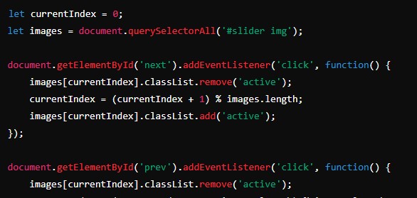
});This JavaScript code handles the navigation functionality. It listens for clicks on the prev and next buttons and adjusts the currentIndex to show the appropriate slide. The showSlide function updates the transform property of the slides container to slide the images horizontally.
Enhancing the Slider with Additional Features
While our basic slider is functional, we can add more features to enhance its usability and visual appeal. Some common enhancements include:
- Autoplay: Automatically transition between slides after a set interval.
- Indicators: Add small dots or thumbnails to indicate the current slide.
- Swipe Support: Enable swipe gestures for better usability on touch devices.
- Pause on Hover: Pause the autoplay functionality when the user hovers over the slider.
Adding Autoplay
To implement the autoplay feature, we can use the setInterval method in JavaScript.
/* script.js - Autoplay */
document.addEventListener('DOMContentLoaded', function() {
    let currentIndex = 0;
    const slides = document.querySelectorAll('.slide');
    const totalSlides = slides.length;
    const prevButton = document.querySelector('.prev');
    const nextButton = document.querySelector('.next');
    let autoplayInterval;

    function showSlide(index) {
        if (index < 0) {
            currentIndex = totalSlides - 1;
        } else if (index >= totalSlides) {
            currentIndex = 0;
        } else {
            currentIndex = index;
        }

        const newTransformValue = `translateX(-${currentIndex * 100}%)`;
        document.querySelector('.slides').style.transform = newTransformValue;
    }

    function startAutoplay() {
        autoplayInterval = setInterval(function() {
            showSlide(currentIndex + 1);
        }, 3000);
    }

    function stopAutoplay() {
        clearInterval(autoplayInterval);
    }

    prevButton.addEventListener('click', function() {
        showSlide(currentIndex - 1);
        stopAutoplay();
        startAutoplay();
    });

    nextButton.addEventListener('click', function() {
        showSlide(currentIndex + 1);
        stopAutoplay();
        startAutoplay();
    });

    document.querySelector('.slider').addEventListener('mouseover', stopAutoplay);
    document.querySelector('.slider').addEventListener('mouseout', startAutoplay);

    startAutoplay();
});
In this enhanced version, we start the autoplay functionality by calling the startAutoplay function. We also stop and restart the autoplay when the user clicks the navigation buttons or hovers over the slider.
Adding Indicators
Indicators provide a visual representation of the current slide and allow users to navigate directly to a specific slide. Let’s add dot indicators below the slider.
HTML
<div class="indicators">
    <span class="indicator active" data-slide="0"></span>
    <span class="indicator" data-slide="1"></span>
    <span class="indicator" data-slide="2"></span>
    <span class="indicator" data-slide="3"></span>
</div>
CSS
/* styles.css - Indicators */
.indicators {
    text-align: center;
    margin-top: 10px;
}

.indicator {
    display: inline-block;
    width: 10px;
    height: 10px;
    margin: 5px;
    background-color: #bbb;
    border-radius: 50%;
    cursor: pointer;
}

.indicator.active {
    background-color: #717171;
}
JavaScript
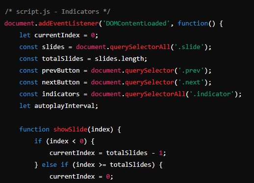
/* script.js - Indicators */
document.addEventListener('DOMContentLoaded', function() {
    let currentIndex = 0;
    const slides = document.querySelectorAll('.slide');
    const totalSlides = slides.length;
    const prevButton = document.querySelector('.prev');
    const nextButton = document.querySelector('.next');
    const indicators = document.querySelectorAll('.indicator');
    let autoplayInterval;

    function showSlide(index) {
        if (index < 0) {
            currentIndex = totalSlides - 1;
        } else if (index >= totalSlides) {
            currentIndex = 0;
        } else {
            currentIndex = index;
        }

        const newTransformValue = `translateX(-${currentIndex * 100}%)`;


        document.querySelector('.slides').style.transform = newTransformValue;

        indicators.forEach(indicator => indicator.classList.remove('active'));
        indicators[currentIndex].classList.add('active');
    }

    function startAutoplay() {
        autoplayInterval = setInterval(function() {
            showSlide(currentIndex + 1);
        }, 3000);
    }

    function stopAutoplay() {
        clearInterval(autoplayInterval);
    }

    prevButton.addEventListener('click', function() {
        showSlide(currentIndex - 1);
        stopAutoplay();
        startAutoplay();
    });

    nextButton.addEventListener('click', function() {
        showSlide(currentIndex + 1);
        stopAutoplay();
        startAutoplay();
    });

    indicators.forEach(indicator => {
        indicator.addEventListener('click', function() {
            showSlide(parseInt(this.getAttribute('data-slide')));
            stopAutoplay();
            startAutoplay();
        });
    });

    document.querySelector('.slider').addEventListener('mouseover', stopAutoplay);
    document.querySelector('.slider').addEventListener('mouseout', startAutoplay);

    startAutoplay();
});
With these enhancements, the slider now features autoplay, navigation controls, and indicators, providing a more comprehensive user experience.
Conclusion
Creating a simple image slider is an excellent way to practice your HTML, CSS, and JavaScript skills. By understanding the basic components and implementing them step-by-step, you can build a functional and visually appealing slider. This guide covered the fundamental aspects, from setting up the HTML structure and styling it with CSS to adding functionality with JavaScript. With additional features like autoplay and indicators, you can enhance the slider to provide a better user experience.
By following this guide, you have learned how to create a simple image slider and gained insights into enhancing it further. As you become more comfortable with these concepts, you can experiment with more advanced features and customize the slider to suit your needs. Happy coding!