Data Visualization
Data visualization is an essential aspect of data analysis and interpretation, allowing us to understand complex data through graphical representation. One of the most powerful and widely used libraries for data visualization in Python is Matplotlib. This comprehensive guide will walk you through the basics and advanced features of Matplotlib, helping you create stunning data visualizations to effectively communicate your data visualization insights.
Journey into Intelligence: Developing a Machine Learning Model in Java
Introduction to Matplotlib
Matplotlib is a versatile plotting library for Python, which provides a wide range of tools for creating static, animated, and interactive data visualizations. Developed by John D. Hunter in 2003, Matplotlib is designed to resemble MATLAB’s plotting capabilities, making it familiar to those who have used MATLAB.
Key Features of Matplotlib
- Wide Range of Plots: Matplotlib supports various types of plots, including line plots, bar charts, histograms, scatter plots, 3D plots, and more.
- Customization: It offers extensive customization options for plots, including colors, labels, titles, legends, and styles.
- Integration: Matplotlib integrates seamlessly with other libraries such as NumPy, Pandas, and Seaborn, making it a powerful tool for data analysis.
- Interactive Plots: With Matplotlib, you can create interactive plots that allow users to zoom, pan, and update the plots in real-time.
Setting Up Matplotlib
Before we dive into creating data visualizations, we need to install Matplotlib. You can install it using pip:
pip install matplotlibAfter installing Matplotlib, you can import it into your Python scripts using the following command:
import matplotlib.pyplot as pltCreating Basic Plots
Let’s start by creating some basic plots to understand the fundamental features of Matplotlib.
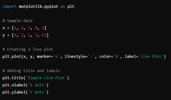
Line Plot
A line plot is one of the simplest and most common types of plots used to visualize data over time.
import matplotlib.pyplot as plt

# Sample data
x = [1, 2, 3, 4, 5]
y = [2, 3, 5, 7, 11]

# Creating a line plot
plt.plot(x, y, marker='o', linestyle='-', color='b', label='Line Plot')

# Adding title and labels
plt.title('Simple Line Plot')
plt.xlabel('X Axis')
plt.ylabel('Y Axis')

# Adding a legend
plt.legend()

# Display the plot
plt.show()
Bar Chart
A bar chart is used to represent data with rectangular bars, where the length of each bar is proportional to the value it represents.
import matplotlib.pyplot as plt

# Sample data
categories = ['A', 'B', 'C', 'D', 'E']
values = [10, 15, 7, 10, 6]

# Creating a bar chart
plt.bar(categories, values, color='skyblue')

# Adding title and labels
plt.title('Simple Bar Chart')
plt.xlabel('Categories')
plt.ylabel('Values')

# Display the plot
plt.show()
Histogram
A histogram is used to represent the distribution of numerical data by dividing the data into bins and plotting the frequency of each bin.
import matplotlib.pyplot as plt
import numpy as np

# Generating random data
data = np.random.randn(1000)

# Creating a histogram
plt.hist(data, bins=30, color='green', edgecolor='black')

# Adding title and labels
plt.title('Histogram')
plt.xlabel('Value')
plt.ylabel('Frequency')

# Display the plot
plt.show()
Scatter Plot
A scatter plot is used to represent the relationship between two numerical variables by plotting individual data points.
import matplotlib.pyplot as plt
import numpy as np

# Generating random data
x = np.random.rand(50)
y = np.random.rand(50)

# Creating a scatter plot
plt.scatter(x, y, color='red', marker='o')

# Adding title and labels
plt.title('Scatter Plot')
plt.xlabel('X Axis')
plt.ylabel('Y Axis')

# Display the plot
plt.show()
Customizing Plots
Matplotlib offers extensive customization options to make your plots more informative and visually appealing. Let’s explore some of these customization features.
Adding Titles and Labels
Adding titles and labels to your plots helps provide context and make them easier to understand.
import matplotlib.pyplot as plt

# Sample data
x = [1, 2, 3, 4, 5]
y = [2, 3, 5, 7, 11]

# Creating a line plot
plt.plot(x, y, marker='o', linestyle='-', color='b', label='Line Plot')

# Adding title and labels
plt.title('Customized Line Plot')
plt.xlabel('X Axis')
plt.ylabel('Y Axis')

# Adding a legend
plt.legend()

# Display the plot
plt.show()
Changing Colors and Styles
You can change the colors and styles of your plots to make them more visually appealing.
import matplotlib.pyplot as plt

# Sample data
x = [1, 2, 3, 4, 5]
y = [2, 3, 5, 7, 11]

# Creating a line plot with different styles
plt.plot(x, y, marker='o', linestyle='--', color='purple', label='Dashed Line Plot')

# Adding title and labels
plt.title('Styled Line Plot')
plt.xlabel('X Axis')
plt.ylabel('Y Axis')

# Adding a legend
plt.legend()

# Display the plot
plt.show()
Adding Gridlines
Gridlines can help make your plots easier to read by providing a reference for the data points.
import matplotlib.pyplot as plt

# Sample data
x = [1, 2, 3, 4, 5]
y = [2, 3, 5, 7, 11]

# Creating a line plot
plt.plot(x, y, marker='o', linestyle='-', color='b', label='Line Plot')

# Adding title and labels
plt.title('Line Plot with Gridlines')
plt.xlabel('X Axis')
plt.ylabel('Y Axis')

# Adding gridlines
plt.grid(True)

# Adding a legend
plt.legend()

# Display the plot
plt.show()
Subplots
Matplotlib allows you to create multiple plots in a single figure using subplots. This is useful for comparing different datasets side-by-side.
import matplotlib.pyplot as plt

# Sample data
x = [1, 2, 3, 4, 5]
y1 = [2, 3, 5, 7, 11]
y2 = [1, 4, 6, 8, 10]

# Creating subplots
plt.figure(figsize=(10, 5))

# First subplot
plt.subplot(1, 2, 1)
plt.plot(x, y1, marker='o', linestyle='-', color='b', label='Plot 1')
plt.title('First Plot')
plt.xlabel('X Axis')
plt.ylabel('Y Axis')
plt.legend()

# Second subplot
plt.subplot(1, 2, 2)
plt.plot(x, y2, marker='s', linestyle='--', color='r', label='Plot 2')
plt.title('Second Plot')
plt.xlabel('X Axis')
plt.ylabel('Y Axis')
plt.legend()

# Display the plots
plt.tight_layout()
plt.show()
Advanced Plots and Techniques
Matplotlib also supports advanced plotting techniques and 3D plotting, which can be useful for more complex data visualizations.
3D Plotting
3D plotting can be achieved using the mpl_toolkits.mplot3d module. Here’s an example of a 3D scatter plot:
import matplotlib.pyplot as plt
from mpl_toolkits.mplot3d import Axes3D
import numpy as np

# Generating random data
x = np.random.rand(50)
y = np.random.rand(50)
z = np.random.rand(50)

# Creating a 3D scatter plot
fig = plt.figure()
ax = fig.add_subplot(111, projection='3d')
ax.scatter(x, y, z, c='r', marker='o')

# Adding title and labels
ax.set_title('3D Scatter Plot')
ax.set_xlabel('X Axis')
ax.set_ylabel('Y Axis')
ax.set_zlabel('Z Axis')

# Display the plot
plt.show()
Annotating Plots
Annotations can be used to highlight specific points or add text to your plots.
import matplotlib.pyplot as plt

# Sample data
x = [1, 2, 3, 4, 5]
y = [2, 3, 5, 7, 11]

# Creating a line plot
plt.plot(x, y, marker='o', linestyle='-', color='b', label='Line Plot')

# Adding annotations
plt.annotate('Highest Point', xy=(5, 11), xytext=(4, 10),
             arrowprops=dict(facecolor='black', shrink=0.05))

# Adding title and labels
plt.title('Annotated Line Plot')
plt.xlabel('X Axis')
plt.ylabel('Y Axis')

# Adding a legend
plt.legend()

# Display the plot
plt.show()
Saving Plots
You can save your plots to a file using the savefig function.
“`python
import matplotlib.pyplot as plt
Sample data
x = [1, 2, 3, 4, 5]
y = [2, 3, 5, 7,